Examples
Adding Min, Max Threshold to a Visualization
Sometimes, it might be useful to visualize how a certain measurement performs relative to its minimum/maximum capacity.
For example, consider two interfaces on a network device. Both interface have an input traffic of 100 Mb/s. However, the first interface has a higher capacity (10 Gb/s) than the second interface (1 Gb/s). The traffic graph for both interfaces would look similar but we would miss the fact that the first interface is running at 1% of its capacity whereas the second interface is running at 10% of its capacity.
Follow the following steps to add threshold values to your measurement queries:
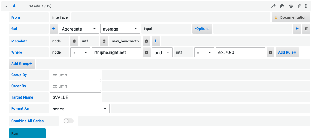
Step 1: Build a query

Create a TSDS query similar to the example shown above. For more information on how to build a TSDS query, see the Query Builder Section.
Note: Your query should also include max_bandwidth metadata field. This field will be used to calculate the maximum threshold value.
Step 2: Add Transformation to query data

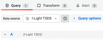
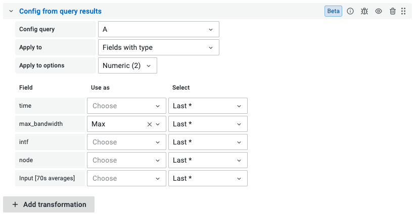
Once we receive the data from TSDS, we need to transform the data to map max_bandwidth as the maximum value of our values. To do this, click on the Transform tab shown above and select Config from query results.
Select the following fields:

- Config query:
A- This is the name of the query you created in Step 1. - Apply To:
Fields with type- Select the best option that will help you apply the transformation to the values in your query. We can apply the max threshold to fields of a certain type. - Apply to options:
Numeric- Based on the option selected in the previous step, the dropdown will show different field types like Numeric, string, time present in our query data. Sinceinputvalues are of Numeric type we will select that option. - max_bandwidth - Use as: Max - Select: Last - This will select the latest value from the
max_bandwidthfield as the maximum value of theinputfield.
We also need to add another transform to hide the max_bandwidth field now. In order to do this, click on Add transformation and select Organize fields.

Click on the eye icon next to max_bandwidth to hide it.
Step 3: Add a visualization
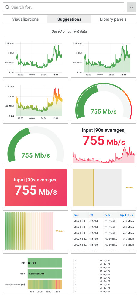
Now that we have our data transformed, we can add a visualization to our dashboard. One convenient way to find visualizations that show the values based on the maximum threshold is to use Grafana’s Panel Suggestions feature.

On the top-right of your panel editor, click on the visualizations dropdown and then select the suggestions tab that displays underneath it.

Grafana should now display different options you can choose from to show the percentage utilization of the interface based on the maximum threshold. Select any visualization you want.